


XPCE provides various mechanisms for two-dimensional layout.
->layout_dialog'
->format'.
This causes the device to place its graphicals according to the
specification in the format object. This technique is frequently used to
label images, place images in an image browser, etc. See section
11.5.1.
library(tabular) provides a user-friendly
front-end for most of the functionality of class table.
Class format can be seen as a poor-mens version of table. On the other hand, there are two cases that still make it a valuable solution. One is to deal with simple compound graphicals, such as a bitmap with a label displayed below it. The other is for browsing collections of graphical objects such as images.
The class icon below displays a label-text below an image.
:- pce_begin_class(icon, device).

:- pce_global(@icon_format, make_icon_format).

make_icon_format(F) :-
        new(F, format(horizontal, 1, @on)),
        send(F, adjustment, vector(center)),
        send(F, row_sep, 2).

initialise(Icon, Img:image, Label:name) :->
        send_super(Icon, initialise),
        send(Icon, format, @icon_format),
        send(Icon, display, bitmap(Img)),
        send(Icon, display, text(Label, center)).

:- pce_end_class.
An example using format
for distribution graphicals over a window is the library library(pce_image_browser).
The class table
acts much the same way as class format
in the sense that it is attached to a device
and modifies the layout management of this device. For this purpose it
uses an interface defined in XPCE version 5.0 and
realised using the methods
`device<->layout_manager'
and `graphical<->layout_interface'.
Figure 22 gives an
overview of the classes realising tabular layout.
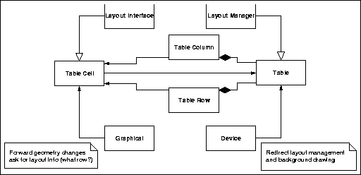
| Figure 22 : Layout manager interface for tables |
The advantage of the approach using layout manager objects is that they can easily be associated with any subclass of device, such as a window. The disadvantage is that the communication gets more difficult due to the different objects involved. This complication is hidden in the XPCE/Prolog class tabular, a subclass of device with an associated table and methods for guiding the messages for common usage.
->sort_rows,
providing the column index and the row below the row holding the button.->append_label_button
and receives the column to sort-on as well as the first row to sort.<-layout_manager.->event'
determines the cell in which the event occurs. If this cell has a `cell<->note_mark'
attached and the graphical defines the method ->on_mark_clicked,
the event is checked against the mark-image. Otherwise the event is
forwarded to the graphical inside the cell, even it it doesn't occur in
the area of the graphical, making small (text-)objects sensitive to all
events in the cell. Finally, this method checks for attempts to drag the
column-borders, changing the layout of the table.
As tabular delegates all messages not understood to
the <-table, the messages of this class are also
available. Below are the most important ones.
->rules.<-border
> 0). The terminology is from HTML-3.<-border
> 0). The terminology is from HTML-3.->cell_padding
applies. In some cases pretty effects can be achieved setting this value
to minus the <-border.
Below we build a small example.
:- use_module(library(tabular)).
:- use_module(library(autowin)).

make_table :-
        new(P, auto_sized_picture('Table with merged cells')),
        send(P, display, new(T, tabular)),
        send(T, border, 1),
        send(T, cell_spacing, -1),
        send(T, rules, all),
        send_list(T,
                  [ append(new(graphical), rowspan := 2),
                    append('Length/mm', bold, center, colspan := 3),
                    next_row,
                    append('body', bold, center),
                    append('tail', bold, center),
                    append('ears', bold, center),
                    next_row,
                    append('males', bold),
                    append('31.4'),
                    append('23.7'),
                    append('3.8'),
                    next_row,
                    append('females', bold),
                    append('29.6'),
                    append('20.8'),
                    append('3.4')
                  ]),
        send(P, open).
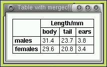
| Figure 23 : Small table with row/column spanning |