


The layout inside a dialog window may be specified by two means, either using pixel-coordinates or using symbolic layout descriptions. The latter is strongly encouraged, both because it is generally much easier and because the layout will work properly if the end-user uses different preferences (see chapter 8) than the application developer.
The following methods can be used to define the layout of a dialog.
All methods actually have both send- and get-versions. The methods
listed only as `->send' methods are unlikely to
be used as get-methods in application code.
->alignment: column
will be alignment horizontally using the references of its upper or
lower neighbour. Horizontally adjacent items with the same alignment
will be flushed left, centered or flushed right if the alignment is one
of left, center or right. The alignment value
is normally specified as a class-variable and used to determine the
layout of rows of button
objects.
The methods above deal with the placement of items relative to each other. The methods below ensure that columns of items have properly aligned labels and values.
<-auto_label_align is @on.
The argument @default assigns the
minimum width of the label, the width required by the text of the label.
->value_width'
is used to negotiate equal width of the value-boxes similar to ->label_width
if
<-auto_value_align is @on.
The methods listed below activate the layout mechanism. Normally,
only `device->layout_dialog'
needs to be called by the user.
->layout'
simply calls
`device->layout_dialog'
using `dialog<-gap'. `Device->layout_dialog'
first uses the <-above, etc. attributes to build
a two-dimensional array of items. Next, it will align the labels and
value of items placed in the same column. Then it will determine the
size and reference point for each of the items and determine the
cell-size. It will then align all items vertically and afterwards
horizontally, while considering the
`dialog_item<-alignment'.
->fit'
to each of the member windows. For class
dialog, this activates ->layout
and then computes the desired size of the window.
Most of the above methods are only used rarely for fine-tuning the
layout. Almost all dialog windows used in the development environment,
demo applications and Prolog library simply use `dialog->append',
sometimes specifying the last argument.
Two problems are currently not taken care of very well. Aligning multiple objects with a single third object can only be achieved using a sub-dialog in the form of a device and often requires some additional messages. The dialog of figure 9 is created using the following code:
layoutdemo1 :-
        new(D, dialog('Layout Demo 1')),
        send(D, append,
             new(BTS, dialog_group(buttons, group))),
        send(BTS, gap, size(0, 30)),
        send(BTS, append, button(add)),
        send(BTS, append, button(rename), below),
        send(BTS, append, button(delete), below),
        send(BTS, layout_dialog),
        send(D, append, new(LB, list_browser), right),
        send(D, append, new(TI, text_item(name, ''))),
        send(LB, alignment, left),
        send(D, layout),
        send(LB, bottom_side, BTS?bottom_side),
        send(LB, right_side, TI?right_side),
        send(D, open).
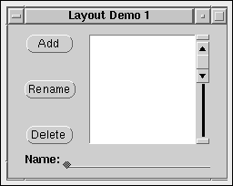
| Figure 9 : Aligning multiple items |
In line 3, a device
is added to the dialog to contain the stack of buttons. This device is
sent an explicit ->layout_dialog to position the
buttons. Next, the list_browser is placed to the right of this stack and
the text_item on the next row.
If you try this layout, the first column will hold the device and the
text_item and the list_browser will be placed right of this column and
thus right of the text_item. Using `dialog_item->alignment:
left' enforces the list_browser to flush left towards the device. Now we
enforce the layout and adjust the bottom and right sides of the
list_browser to the device and text_item.
Dialog windows do not reposition
their contents if the window is resized in the current implementation.
If the window is enlarged, the items stay in the top-left corner. If the
window is made smaller, part of the items may become invisible. Resizing
can be implemented by the user by trapping the `window->resize_message'.